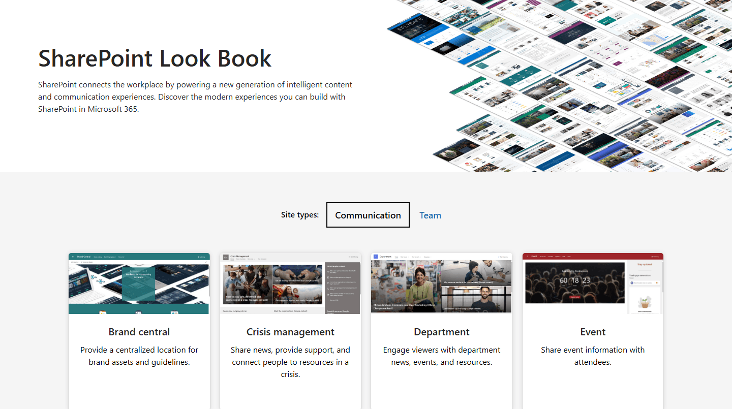
If you have gone looking for the SharePoint lookbook recently and found a dead link, you are not imagining it. The original site at lookbook.microsoft.com - the one that let administrators browse a gallery of site designs and deploy them straight into their tenant - is gone, and it is not coming back.
In summary: The original SharePoint lookbook at lookbook.microsoft.com went offline on 27 June 2024 and has been permanently retired. A reduced version of the gallery still exists on Microsoft's adoption site, but it is now for inspiration only, and the one-click provisioning feature no longer works. Organisations looking for ready-made starting points in 2026 have three practical routes: the gallery on Microsoft's adoption site for inspiration, the built-in SharePoint template gallery for individual pages, and community PnP templates deployed via PowerShell for whole sites. Where branding needs to hold across many sites, an in-a-box product is a fourth option.
Was the SharePoint lookbook discontinued?
Yes. Microsoft took lookbook.microsoft.com offline on 27 June 2024 and confirmed in its own community forums that the site has been retired, with no plans to bring it back.
There was no loud announcement, which is why the question still comes up two years later. What tends to happen is that someone finds an old blog post, a training course or a Microsoft Learn article pointing at a lookbook URL, follows the link and hits nothing. Microsoft Learn's guidance on provisioning the SharePoint Success Site still opens with a notice that the look book is unavailable and sends readers towards PnP templates instead.
So if a colleague told you to just grab it from the lookbook, that advice was sound when they gave it, and it is worth understanding what changed rather than assuming the designs themselves have gone away, because they have not. Our own earlier article on the lookbook described the same view-and-deploy gallery and is now out of date too, which is part of why we have rewritten it.
Is the SharePoint lookbook still available anywhere?
Partly. A gallery still lives at adoption.microsoft.com, and it remains the closest thing to a successor: the same kind of design examples covering brand central, crisis management, department sites, HR, leadership connection, onboarding, organisation home, showcase and volunteer centre, and still worth ten minutes of anyone's time when you are trying to agree what good looks like with a steering group.
What it no longer does is provision. The real value of the old lookbook was that a global administrator could click a button and have a fully structured, pre-populated site appear in the tenant, and that is the part that disappeared. Microsoft now points in two directions instead: the adoption gallery, for designs close to the retired originals that a site owner then applies through the standard SharePoint interface, and the PnP provisioning templates repository on GitHub, for the original templates themselves. Microsoft's developer documentation confirms that the repository holds what the lookbook service used to serve, although applying anything from it is a PowerShell job rather than a click.
The change in effort is the thing to plan around, because the adoption gallery helps you decide what you want but does not build any of it. That is useful while you are still agreeing a direction with stakeholders, but it will not stand a site up for you, and if someone in the business is expecting a working site by Friday it is better to say so early than to discover it at the deployment stage.
What has Microsoft released instead?
There is better news. While the lookbook was being retired, Microsoft was rebuilding starting points directly into the SharePoint authoring experience, which for many organisations is a better place for them to live than an external website nobody remembers to visit.
The new SharePoint template gallery became generally available for commercial tenants in 2025, pulling Microsoft's own designs, full-page apps and anything your team has saved on a site into one place. Between March and April 2026, Microsoft added 31 more page and news designs alongside better browsing, filtering and search, and made the gallery the default entry point for page creation, so a content editor who clicks New now lands in the gallery instead of on a blank page.
That last change is the one worth reading properly, because Microsoft has decided that a curated set in front of the author is better than an empty canvas, which is the conclusion we reach on most intranet projects - usually after watching a content editor spend a morning trying to build a landing page from nothing.
We have changed our own advice because of it. We used to point clients at the lookbook as the first stop for design inspiration, and now the first thing we ask is whether anyone has looked properly at what is already sitting in their own tenant, because a lot of teams are still working from assumptions they formed two or three years ago.
Which of the three routes should you use?
Three routes are worth considering, and they solve different problems.
The table cannot capture one thing, which is that these routes are not mutually exclusive, and in our experience the organisations that get the most out of them use all three: the adoption gallery to agree a direction with stakeholders, PnP templates to stand up the site structure, and the built-in gallery to keep individual pages consistent once the intranet is live.
What do templates need to work well?
Templates solve the blank page problem, and they solve it well enough that I would rather no client ever created a page from scratch again. What they do not solve on their own are the four problems that tend to surface once the site is live, and three of the four are content governance questions rather than design questions.
A template is not a finished site. A deployed template needs content, owners and usually a web part or two that was not in the original design, and we regularly see site owners treat a Microsoft template as complete because it came from Microsoft, then abandon it half-populated. What makes the difference is the wrapper you put around it: written guidance, a couple of worked examples, and someone a content owner can ask.
Templates do not know about your information architecture. A newly provisioned site still has to fit your existing hub structure, navigation and permissions model, none of which arrives with the template, and retro-fitting all that afterwards is considerably harder than planning it up front.
Open choice fragments the employee experience. This is the one I would put most weight on, because it is the hardest of the four to undo later. When content editors can pick freely from a wide, open gallery, sites end up built from different starting points: one department leads with news, another buries it under a fold of quick links, a third uses a layout nobody else uses. Each page looks perfectly reasonable on its own, while the employees moving between them have to relearn where things are every time, and the sites no longer hang together as one intranet.
The fix is curation rather than restriction. A pre-approved set that content owners choose from will hold the employee experience together far better than an open gallery they browse, and it does that without locking pages down: a site owner can still cut a section they do not need, reorder what is left or swap a web part, and a department landing page with no events to promote should not be carrying an empty events section. What a good set standardises is the pattern - where the page leads, what the top of the page is for, where news and navigation sit relative to everything else - while the content inside it flexes to the audience. That is the combination that makes templates worth investing in properly, and it is why we build ours the way we do.
Microsoft's templates are deliberately brand-neutral. They are built to work for every organisation, which is the right decision for Microsoft to have made, and it does mean the output looks like SharePoint. For organisations with strong brand standards, or several sub-brands to accommodate, that neutrality is something you will want to design over rather than live with.
One of the things that most often breaks the employee experience is different parts of the organisation presenting their content in their own styles and templates. You end up with a patchwork of disconnected, standalone sites, and people have to relearn the interface every time they move into another department. The fix is a consistent, centralised set of templates. The lookbook gave you some of that, but it never quite solved the problem. That is what we have baked into Lightspeed365: 15 pre-built templates covering the use cases we have seen most often across twenty years of designing and running SharePoint intranets.
— John Scott, head of UX
Want to know whether your current intranet is holding up? Take our free intranet health check - about ten minutes, and you get a score across communications, self-service, engagement and governance.
How do you get a branded intranet on top of native SharePoint?
If the gap you are hitting is branding and control rather than structure, an in-a-box product sits on top of native SharePoint and takes its template model considerably further. That is a fourth route on top of the three above, and if you are weighing them properly our build or buy decision guide compares all four on cost, effort and long-term ownership.
Lightspeed365 is our SharePoint-native intranet product, built by Content Formula, specialists in Microsoft 365 digital workplaces since 2005. Content Formula delivers all three approaches - out of the box, in-a-box and custom build - which is why we can be straight with you about which of the routes above you actually need. Lightspeed365 ships with 20 page templates covering homepages, landing pages, content pages, news landing pages and content roll-ups, a branding customiser for corporate colours, fonts and sub-brand themes, and a set of additional web parts.
The templates are the part clients notice first, and they come out of years of intranet projects and what we have learned about how employees read a page: what belongs at the top, what earns the middle, and what people will scroll for. A content editor gets a page that works on the first attempt, without a designer, without a workshop and without discovering six months later that nobody scrolled far enough to reach the thing they put at the bottom. It is also where speed to market comes from, because a content owner working from a pre-approved template is not waiting on a designer or a developer to get a department site live.
Used as a curated set, the templates give content editors real freedom to build while keeping every department site recognisably part of the same intranet, and in our experience that consistency is a large part of what drives adoption once the launch noise has died down. The web parts follow the same logic. We are not trying to ship more web parts than anyone else, because a long list is not a benefit and much of it goes unused. Each one exists because the same requirement kept coming up on client projects, and teams were otherwise solving it with a custom build or a spreadsheet. For the wider picture, our rundown of 15 must-have SharePoint web parts covers the native ones alongside ours.
If you want to see the templates themselves, our rundown of 10 SharePoint intranet templates for 2026 walks through five site templates and five page templates with screenshots of each. For finished intranets instead of starting points, 10 real SharePoint intranet examples covers actual client builds, and our gallery of real client intranet designs shows homepages, department sites and branded themes from live projects.
See Lightspeed365 in action
Take the free intranet health check to see where your current intranet stands, or book a demo to see how a branded SharePoint intranet comes together.
Frequently asked questions
About the author

John Scott
UX director and Lightspeed365 product owner
20 years designing and delivering digital workplace solutions for enterprise and professional services organisations. Has led multiple projects integrating AI for intelligent search and data classification, with a UX-led focus on making those tools intuitive and adoptable for everyday employees.