

SharePoint intranet designs built with Lightspeed365

SharePoint intranet design is where most intranet projects either win or lose their audience. The platform is capable, but out of the box it looks like SharePoint - and employees notice. A branded intranet signals that the thing is official, maintained, and worth returning to.

By John Scott

BaringaDixons Academies TrustK. Hovnanian Homes

The designs below are real. Some are client projects delivered through discovery, design and build. Others are concept designs included with every Lightspeed365 licence. None required custom development - every one was built inside SharePoint Online using the standard page editor.

What is SharePoint intranet design? SharePoint intranet design is the application of an organisation's brand identity - colour, typography, navigation, imagery and page layout - to an intranet built on SharePoint Online, so it looks and behaves like the business rather than like default SharePoint.

Four SharePoint intranet design styles

Four real client intranets, each showing a different design direction. All built inside SharePoint Online, none needing custom development.

Design style 01

Bold and high-contrast

Dark theme, saturated brand colour, oversized typography. The clearest proof that a SharePoint intranet does not have to look like SharePoint.

Anonymised motorsport organisation

Formula 1 · client cannot be named

A bold treatment tells employees this is not a default Microsoft tool. Dark backgrounds, a saturated brand colour and oversized type work when the organisation already has a strong visual identity and wants the intranet to feel like a product, not a document library. It has to be done carefully. Contrast, type size and how much colour sits on screen all need to hold up across news, apps and people search, or the homepage becomes exhausting rather than distinctive.

Dark themeHigh contrastBrand-led
  • Palette - a dark base carries the page, with one saturated brand colour used for actions, highlights and key navigation rather than washed across every web part.
  • Typography - heavy weights and a larger scale make the brand visible. Headlines sit well above body copy, so the page can still be scanned.
  • Accessibility - dark themes fail WCAG when accent colour is used for text. We check contrast on every text and interactive state before the theme is signed off.
  • Suits - organisations with a distinctive brand that want the intranet to feel like a product, including consumer, media, sport and creative businesses.
  • Web parts - a hero area and news feed carry the brand at the top; card links and an app launcher put operational tools underneath. All configured in the native SharePoint page editor.
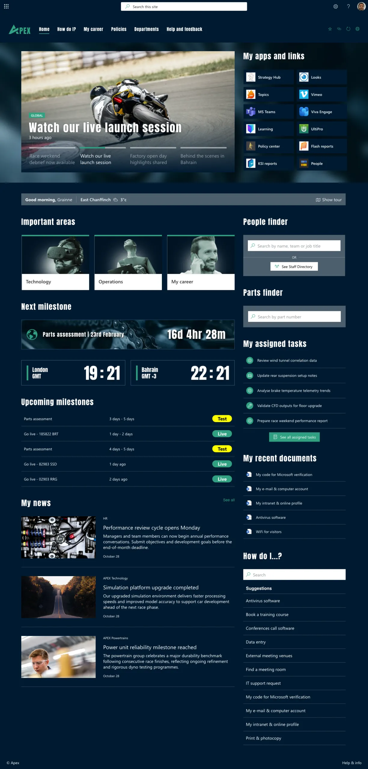
Bold dark-themed SharePoint intranet design for a motorsport organisation

Design style 02

Restrained and editorial

Typography-led, generous white space, colour used sparingly. Design that gets out of the way of the content.

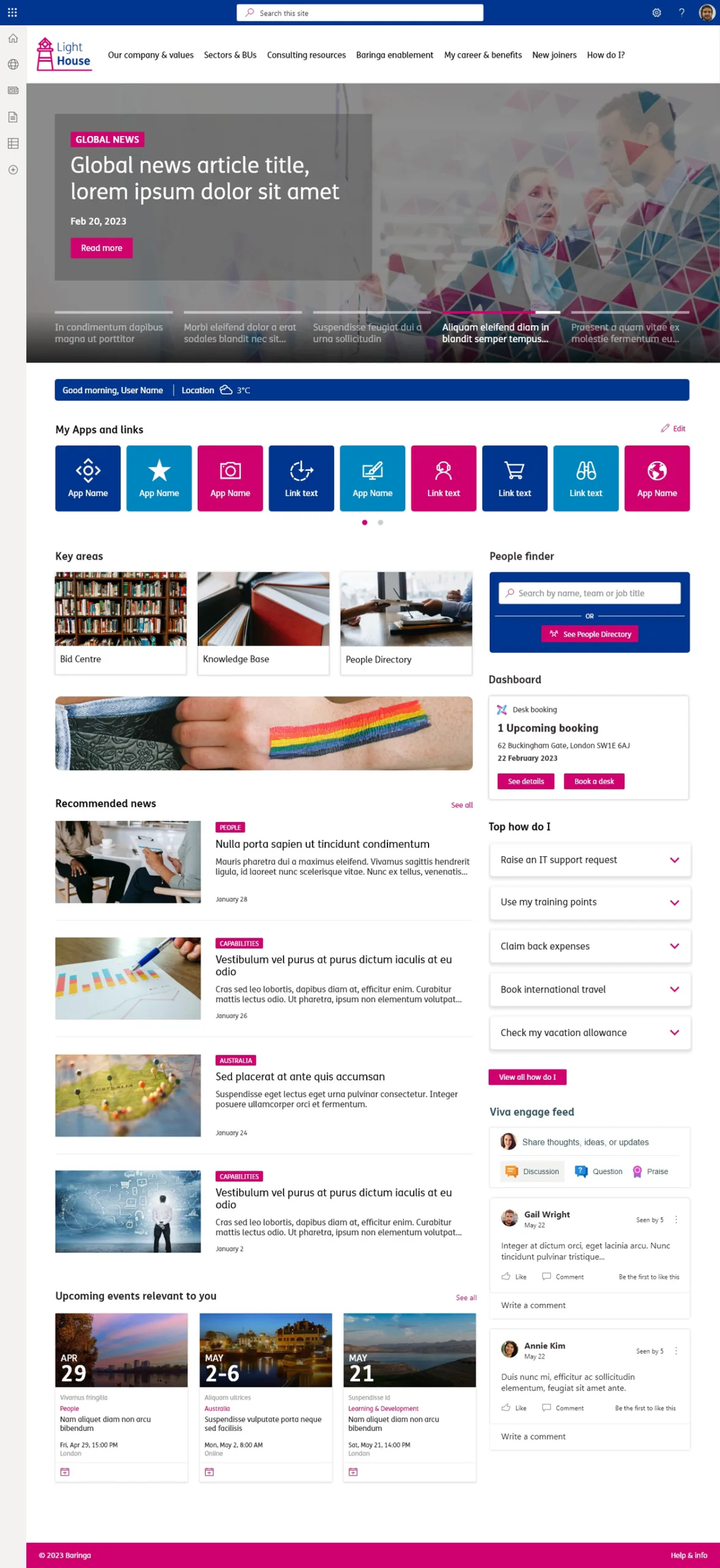
Baringa

Professional services · global

Baringa

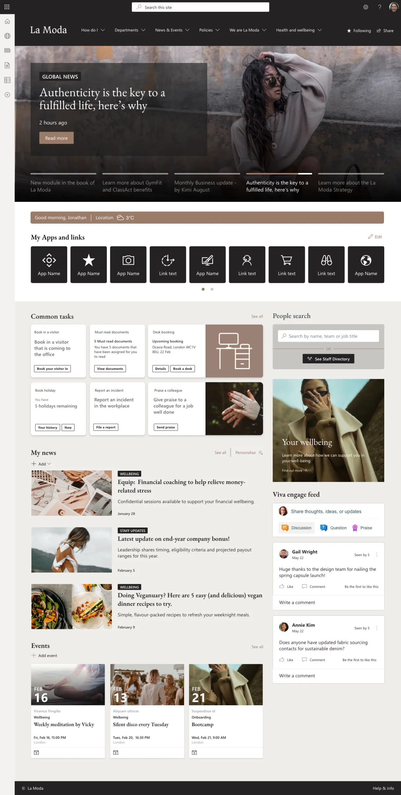
Consulting and knowledge-led businesses produce a lot of content. The design has to support reading, scanning and finding people, not compete with the page. Baringa's Light House homepage uses a restrained palette, generous space and a clear type hierarchy so news, apps, people search and desk booking can sit together without feeling busy. Colour is used to signpost, not to decorate.

Professional servicesGlobalContent-led
  • Palette - a small set of brand colours, used consistently, is enough for recognition. Most of the page stays light so content remains the focus.
  • Typography - hierarchy and scale do the work that colour does in bolder designs. Headlines, section labels and body copy are clearly distinct.
  • Layout - white space and a predictable structure make it obvious where news, tools and people live. Employees should not have to hunt.
  • Suits - professional services, legal, financial services and any organisation where people come to read and find things, not to be entertained.
  • Web parts - a news feed, people directory, app launcher and Viva Engage discussions sit on one homepage, with desk booking surfaced alongside. That is how a one-stop shop is built without custom code.
Restrained editorial SharePoint intranet design for a global consultancy

Design style 03

Soft and app-like

Rounded cards, soft shadows, generous touch targets. An iOS-influenced treatment that suits mobile and frontline use.

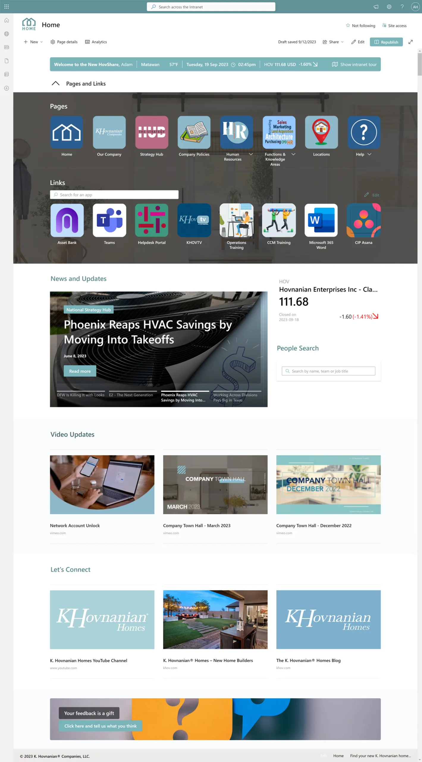
K. Hovnanian Homes

Homebuilding · USA

K. Hovnanian Homes

A large share of K. Hovnanian's people use the intranet. The design had to feel like an app: rounded cards, soft shadows and targets you can hit with a thumb. iOS-style navigation gets people to critical pages and apps without a desktop-first layout that falls apart on a small screen. If the intranet is going to be used in the field, it has to look and behave as if that was the starting point, not an afterthought.

Real estateUSAMobile-first
  • Card treatment - generous radius, light shadow and even spacing make blocks read as tappable cards rather than webpage sections.
  • Touch and mobile - primary actions and navigation are sized for a thumb. The same layout has to work on a phone in the field, not only on a monitor in the office.
  • Palette - brand colour sits against a soft, light background so cards and icons stay readable outdoors and on a smaller screen.
  • Suits - construction, field service, retail and any organisation where a large share of employees will open the intranet on a phone.
  • Web parts - card links and an app launcher sized for a thumb, plus a welcome bar and news feed stacked for a phone-first layout. The iOS-style navigation is still SharePoint page editing.
App-style SharePoint intranet design for field and office teams

Design style 04

Sub-branded across divisions

One intranet, multiple identities. Each division, region or brand carries its own colours and typography inside a shared structure.

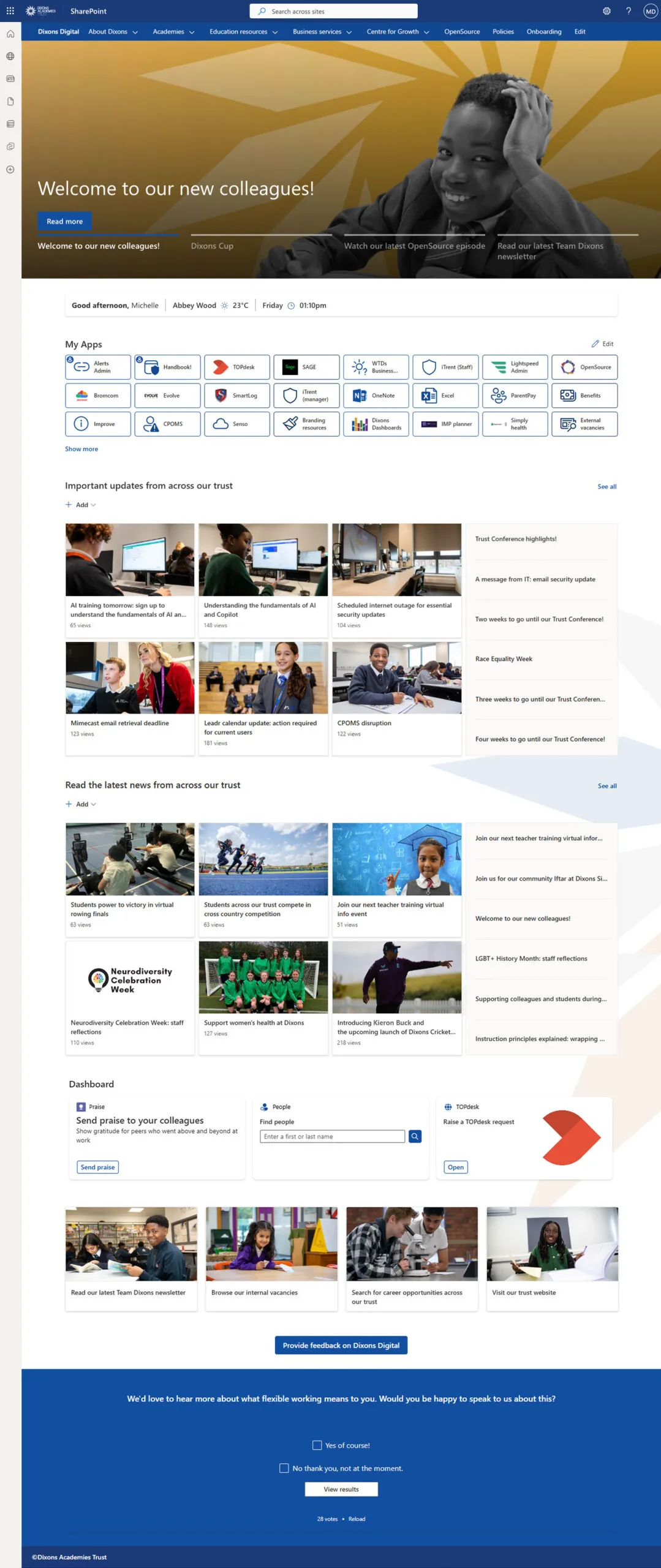
Dixons Academies Trust

Education · UK

Dixons Academies Trust

Multi-academy trusts, group businesses and federated organisations cannot put one identity on every site and expect it to feel right. Dixons Academies Trust needed one intranet for 3,000 staff across 30 schools, with each academy able to carry its own colours and typography inside a shared structure. Navigation, templates and the way content is organised stay the same, so people can move between a trust-wide homepage and a school site without relearning the intranet. Local identity with a shared structure is something native SharePoint does not give you out of the box.

EducationUKMulti-brand
  • Sub-branding - each academy keeps its own colours and type, so staff recognise their school, while trust-wide content stays in the parent identity.
  • Shared structure - navigation, templates and layout stay consistent so the intranet still feels like one system, even when the branding varies.
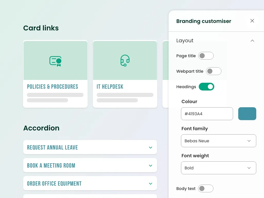
  • Governance - a small set of allowed sub-brands, applied through the branding customiser, stops every site owner inventing their own look.
  • Suits - multi-academy trusts, group businesses, and any organisation with regions or brands that need their own identity inside one intranet.
  • Web parts - the branding customiser applies each academy's colours and type; shared news, card links and navigation web parts keep the structure consistent across 30 school sites.
Dixons Academies Trust SharePoint intranet design homepage for staff across 30 schools

Trust homepage

Before and after

Native SharePoint gives you a communication site. Branding is what turns that into something employees recognise as theirs.

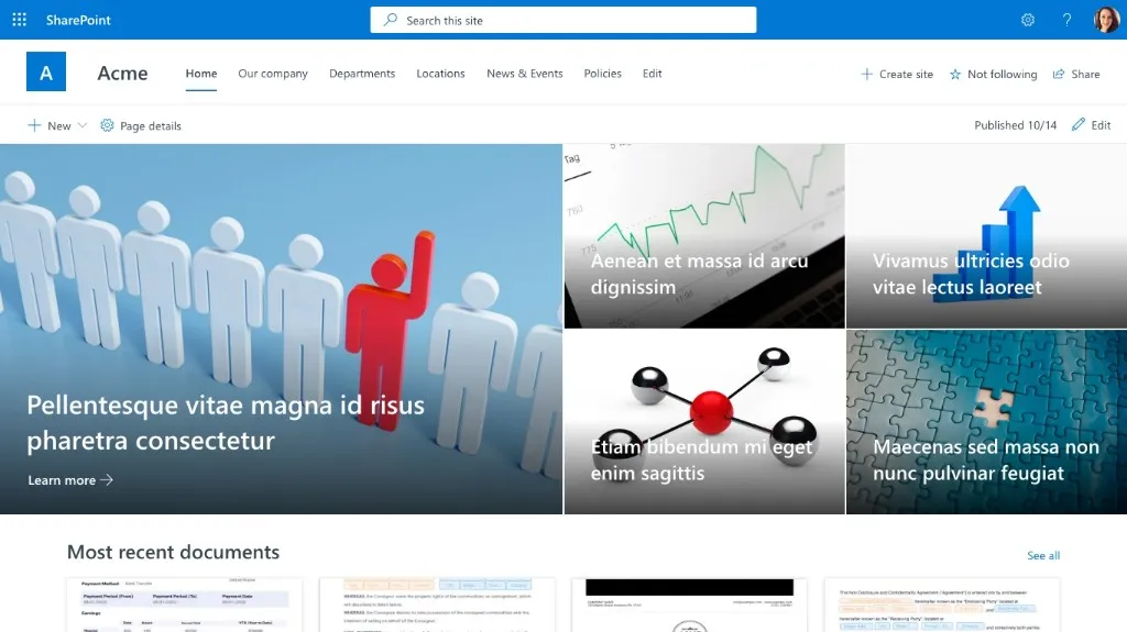
Both pairs start from the same default SharePoint look. What changes is palette, typography, navigation and the hero treatment - not a custom-coded front end. The first after is light and imagery-led. The second is a dark, high-contrast dashboard, so you can see how far two SharePoint intranet designs can travel from the same starting point.

Before - native SharePoint

Default SharePoint intranet design before branding

After - branded with Lightspeed365

Branded SharePoint intranet design with a light imagery-led homepage
A light, imagery-led homepage. Colour, type, navigation and the hero all change; underneath it is still a SharePoint communication site.

Before - native SharePoint

Default SharePoint intranet design before a dark branded theme

After - dark high-contrast branding

Dark high-contrast SharePoint intranet design after Lightspeed365 branding
A bold, dark treatment of the same platform. Saturated brand colour, oversized type and a task-focused layout - a different SharePoint intranet design from the pair above.

Want to see what yours could look like?

We will show you these designs properly, then talk through what would work for your brand and your employees.

Or start a free trial

30 minutes, no obligation.

What makes a great SharePoint intranet design?

Five principles that hold across every project we deliver.

Design decisions that matter more than styling

Styling is the easy part. The decisions that actually change whether people use the intranet are layout, what sits above the fold, how consistent sites feel from one department to the next, and whether the design holds up in Teams and on a phone.

Start with a template, not a blank page

A blank SharePoint page invites every site owner to invent their own layout. Start from a proven template, then apply your theme for colour, header layout and navigation style. Our SharePoint intranet templates give you starting points for homepages, department sites, topic hubs and content pages, so the design work is about identity rather than reinventing structure.

Layout beats styling

Colour and type can wait. What changes whether people use the intranet is what sits above the fold, how sections are grouped, and whether the two or three things employees actually come for are obvious on first glance. A full-width hero, clear section backgrounds and a predictable grid do more for adoption than a refined palette on a confusing page.

Consistency across sites

Employees move between a homepage, a department site and a topic hub in the same day. If each one looks and behaves differently, they stop trusting the system and go back to email. Consistency across sites matters more than any individual page looking striking - shared navigation, shared templates, and a small set of allowed variations.

Build it from web parts

Every element on these pages is a SharePoint web part, configured in the native page editor. That is what makes the no-custom-development claim true: news, people search, app launchers and card links are building blocks your comms team can rearrange, not a one-off build that only a developer can change.

Accessibility is a design requirement

Contrast, type size, focus states and keyboard access have to hold up across every theme we ship - including dark themes and sub-brands. We design to WCAG 2.2 and the European Accessibility Act because public-sector buyers and large employers now expect it, and because a branded intranet that people cannot actually use is not a design win.

Lightspeed365 branding customiser on a SharePoint intranet design, showing heading colour, font family, and font weight controls

SharePoint intranet design ideas

Visual approaches you can apply to your own intranet.

  • Colour systems

    A full brand palette can run across headers, buttons, section backgrounds and web parts without the intranet becoming a colour chart. We typically pick one or two colours for actions and navigation, then keep the rest of the page quiet so news and tools stay readable.

  • Sub-branding across divisions

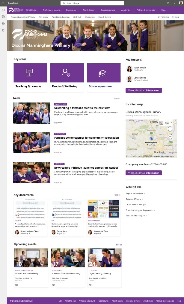
    Each brand, region or division can carry its own colours and typography inside one intranet. Navigation and page templates stay shared, so people still know how to move around. That is how a multi-academy trust or a group business keeps local identity without fragmenting the system.

  • Typography and hierarchy

    SharePoint will use your corporate typeface once it is loaded through the branding customiser. Hierarchy then does most of the work: a clear difference between headlines, section labels and body copy makes pages scannable and makes the brand visible without extra decoration.

  • Imagery and photography

    Real employee photography carries culture in a way stock libraries do not. We use it for heroes and people-led stories, and keep generic imagery for functional pages where a photo would only get in the way. The test is whether someone who works there would recognise the organisation.

  • Dark themes

    A dark intranet works when the brand is already high-contrast and the homepage is meant to feel like a product. It fails when body text, links and icons drop below readable contrast. We treat those checks as part of the design, not a later accessibility pass - the motorsport example above is the proof point.

  • Designing for Teams and mobile

    Most frontline employees will see the intranet in the Teams app or on a phone, not on a widescreen monitor. Touch targets, type size and how cards stack on a narrow screen are the design. If it only looks right on desktop, it is not finished.

SharePoint intranet design questions

See more intranet layouts

Looking for homepage layout patterns rather than branded designs? Our most popular blog post breaks down 10 real SharePoint intranet examples by structure and use case.

  • 1

    Book a demo

    Thirty minutes. We show you these designs properly.

  • 2

    See your brand applied

    We apply your colours and typography during onboarding.

  • 3

    Go live in weeks

    Built in SharePoint Online. No custom development.

See what your SharePoint intranet could look like

We will listen to what you are trying to solve, show you the parts that matter, and figure out the right next step together.

Or start a free trial · see pricing